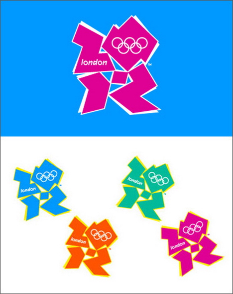
Today, Garret over at Orange Element wrote about the new logo for the London Olympics. Hand it to Garret for always making people stop and think about design.
Anyway, it started a conversation with a colleague of mine. I’ll call him Henry, since I’m sure he would not appreciate me telling you who he is after you finish reading this.
So Henry asked me what I thought of the logo. I told him what I wrote on the Orange-Blog…
I agree that most people don’t realize the brand audit, team building, strategy that goes into the process. On the other hand, $800K is steep (though I’ve seen clients who paid more for less). I don’t personally care for the logo – think it’s hard to get a read on what it is (I had to look a few times) but that’s not important. What I do wonder is who is the target audience for the Olympics? If it’s hip, 20-somethings it might be right on. I, however, think the audience is quite a bit broader, older, and more conservative and wonder if it’s on track. Just my 2 cents.
And I pointed him to the other commenters – who had some interesting things to say.
Henry told me that he saw something sexual in the logo. I went back and looked and, you know what? I saw it too.
I told Henry that I didn’t think the logo was a quick read. I didn’t see the 2012 right away.
And Henry’s response?
There’s a 2012 in the logo? Where?
I rest my case.


Add me to the people who had NO IDEA it said 2012. I totally missed it.
Leeann
Great post Wendy! And very useful – was having a conversation with a 30 something designer yesterday who’s on my new project team. We were discussing ways to “sex” up the new site a bit, with tools, etc. I asked the IA if there was a way to merge Outlook with an online calendar tool. The designer took it one step further – text emails. Thing is, the target audience doesn’t use text messaging much. At the end of the day, it comes down to your audience and what and how you’re trying to communicate. To me, the 2012 logo is confusing and hard to decipher without the cues you provided.
Ok, and I can say this because I have been a graphic designer for the past 25ish years…
that logo is UGLY.
just my professional opinion.
of course your audience is always key and you do bring up an excellent point that I think is often missed in the rush to be current, but again, this sucker is just UGLY.
AND in your little focus group here 2 people have already not seen the key message.
scary
there is nothing special about that logo. I recall that most logos of Olympics past had something to do with the hosting country. they looked representative of the country’s feel. All I see in this logo is a bunch of misshapen Legos.
So I kind of like the logo. It looks like people dancing. But then again, I am a 20 something. I didn’t see the 2012 at first either, but I like that it was back there. I like a logo that keeps on giving.
so, first I saw legs running. Then I saw 2012. I guess I’m young and hip…who knew?
I agree it is not a winner, although I realized that I need to get out more and spend less time with playdough and legos because I did not even know that the next Olympics was going to be in London. I definitely did not see the 2012 until Wendy pointed it out, I just see a bunch of Z’s placed in a bizarre arrangement. See you, Lisa
I’ve always liked it – and yes indeed, there’s a 2012 in there.
John, however, thinks it’s as ugly as the BBC’s monkey mascot for the Beijing Olympics coverage.
Of the people I know here in the UK, I’d say we represent the 50/50 love/hate view.
Janet